CASE STUDY

Barclays were looking to deliver ‘Best In Class’ UCD experiences for a new multi-facetted merchant payment gateway and a mobile wealth management application for investments, deposits, savings and international payments & transfers.
Empathetic research/information gathering, key user interviews, competitor analysis, defining user personas, user journey mapping, Lo-fid sketches & wire frames, lo/Hi Fidelity designs and prototypes as well as exploring new & evolving technologies through to workshop facilitation helped define and deliver clear objectives for both epic work streams.
Working in an agile environment, collaborating with the UX/UI design team members, Senior PO’s, PM’s, Business Analysts,
Stake Holders, UX/UI researchers, Copywriters, frontend and backend programmers were intrinsic in delivering highly considered
and unique user centred design solutions for both applications.
Methodology Processes
SETTING GOALS & OBJECTIVES
THE PROJECTS – A multi-faceted payment gateway that gave specific users ultimate flexibility in money management at the highest level, and a mobile application that allowed users holding significant wealth the ability to take more control of their finances, providing ultimate flexibility in managing their investments and savings without having to rely on banking involvement.
OBJECTIVES – Both application processes required radical thinking to provide flexibility for easier money management, as well as providing detailed information that would allow users to make key financial decisions in a highly secure environment.
REQUIREMENT – The merchant gateway was very much a cloud based desktop platform with the wealth management application being compatible with Android and Apple products
PRIMARY AUDIENCE – The merchant gateway was geared to large organisations with multiple users, offering flexibility and significant accessibility and security with large volume & high value transactions. The wealth management app helps provide high net worth individuals the freedom, security and flexibility to personally manage their own investments in their own time with absolute confidence.
RESEARCH
The user research gathered detailed insights of the 2 distinct user groups. Observational techniques and feedback methodologies looked at specific user behaviour, needs, and pain points. The goals helped the UX team understand both groups, identifying context and perspectives that helped to make informed decisions, on the products and services required.
WORKSHOPS
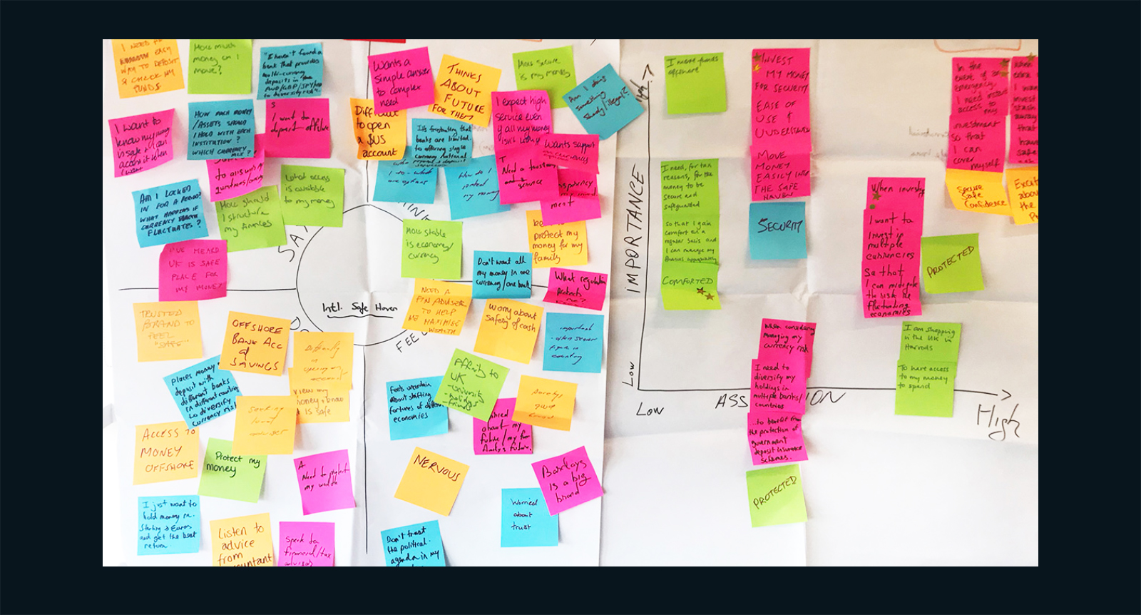
Collaborative sessions focussed on group involvement. In the earlier sessions the product teams focussed on specific user access and pain points before focussing on specific tasks. The outcomes helped prioritise and define product solutions and reduce assumptions.
CARD SORTING
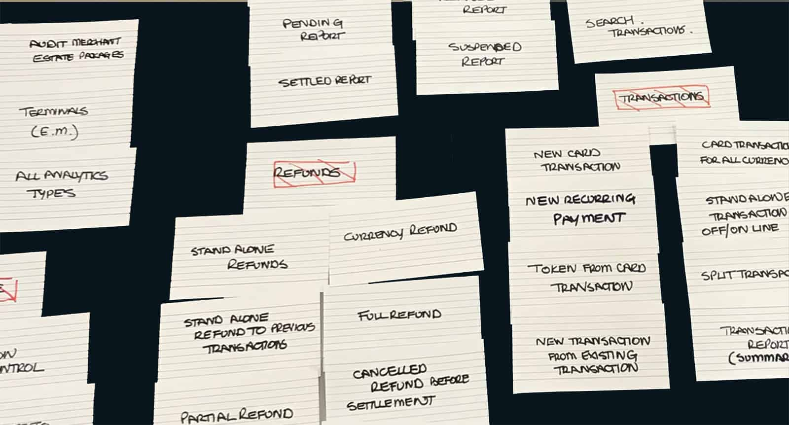
Regular card sorting early in the UX process helped to gain a clearer direction and understanding of what services and products were high priority and key in the earlier stages of product refinement.
BUILDING PERSONAS
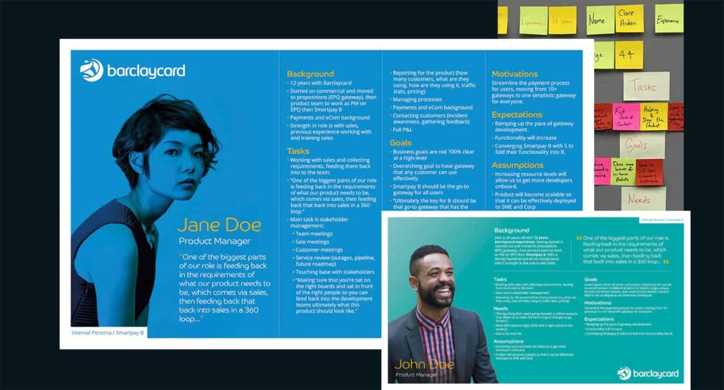
Individual personas were created from the information gathered from research and interviews. The distinct persona style identified key users, there skills, how they find information, their pain points, goals, motivational aspects, needs and contact information.
COMPETITOR RESEARCH & ANALYSIS
Our research focussed on key competitor payment gateways i.e. Worldpay, Paypal, Stripe etc. The research helped the team identify common features, strengths and weaknesses but more importantly the features that the competitors did not have.
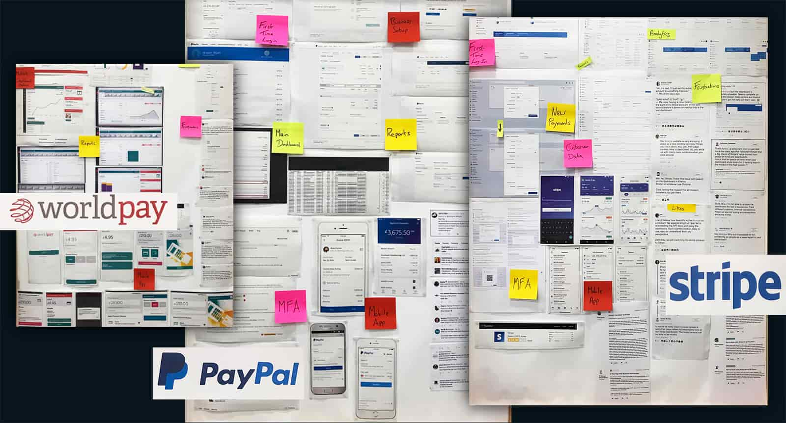
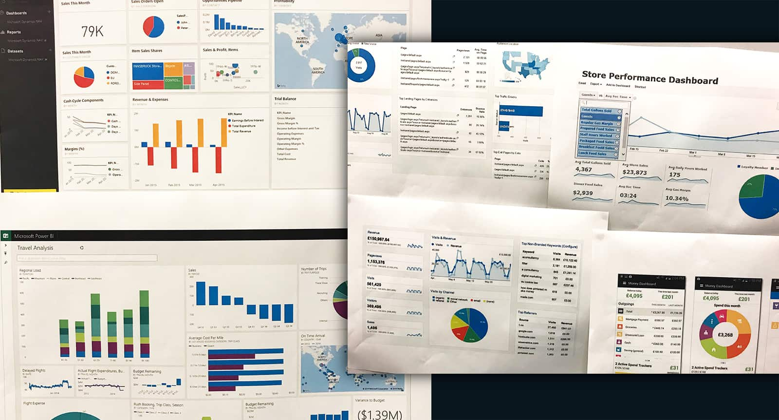
DASHBOARD RESEARCH
Dashboards provide a very powerful opportunity to influence user behaviour and boost retention rates. The data collected through in-depth research helped us to identify dashboard designs that communicated information with actionable and relevant data through simplicity.
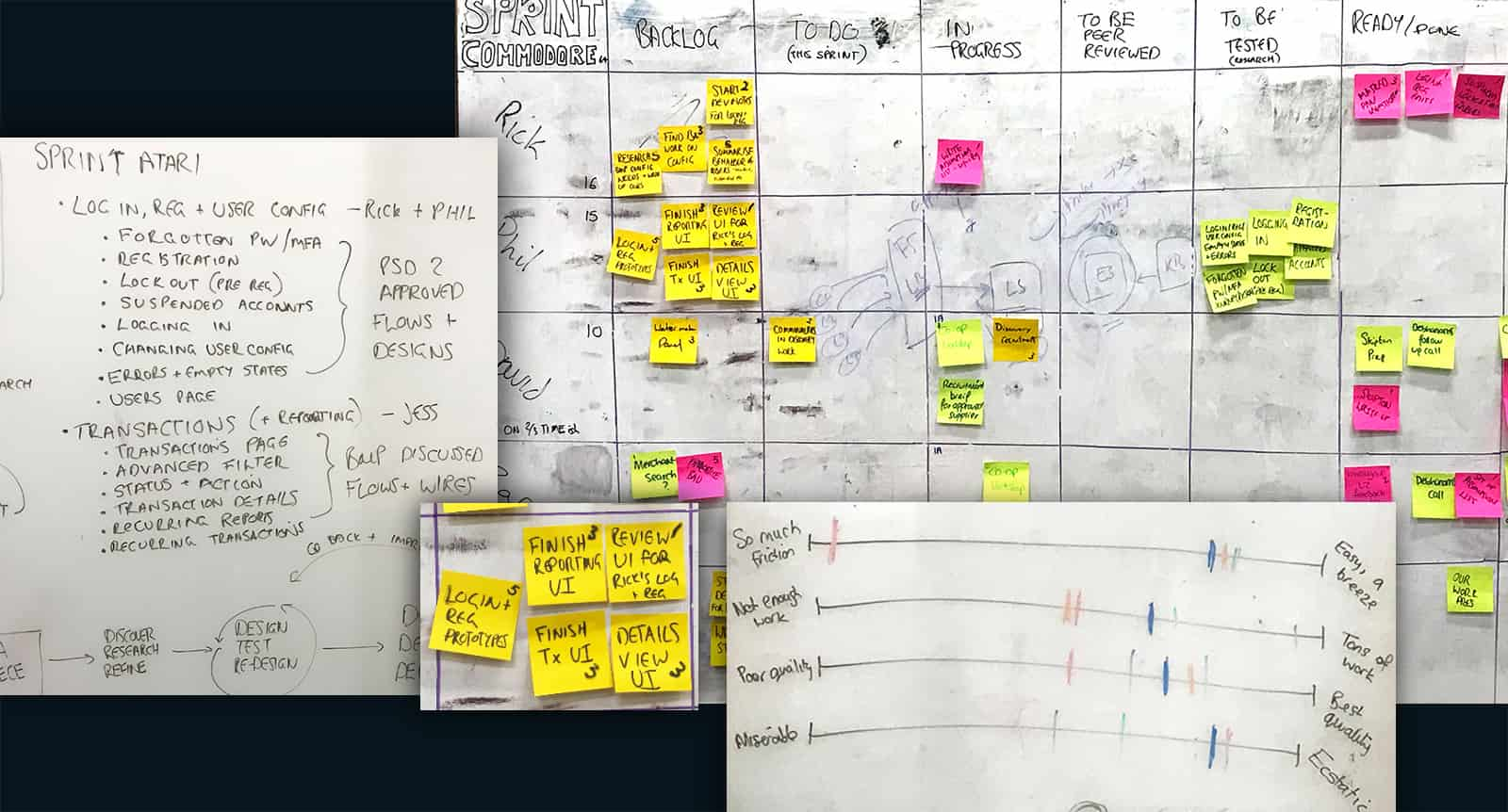
DESIGN SPRINT PLANNING
Regular 5 day sprint planning sessions allowed the team to answer critical business questions though design, prototyping and testing ideas. Each individual within the team was set weekly task and tickets were raised around specific requirements. Each ticket carried a sliding level of involvement covering:
1. Friction
2. Volume of Work required
3. Quality
4. Enjoyment
Each new sprint period would also cover off critical pain points and identify requirements for further workshops.
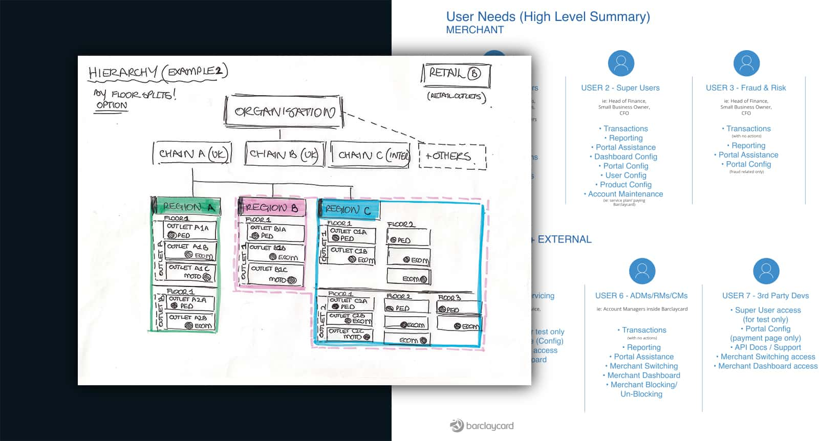
HIERARCHIES
A clear visual hierarchy helped to guide users to the most important elements on the page. A key part of the user hierarchy within the merchant gateway was to focus on clear grouping channels providing the merchant organisations the flexibility they required to communicate and deliver.
SKETCHING
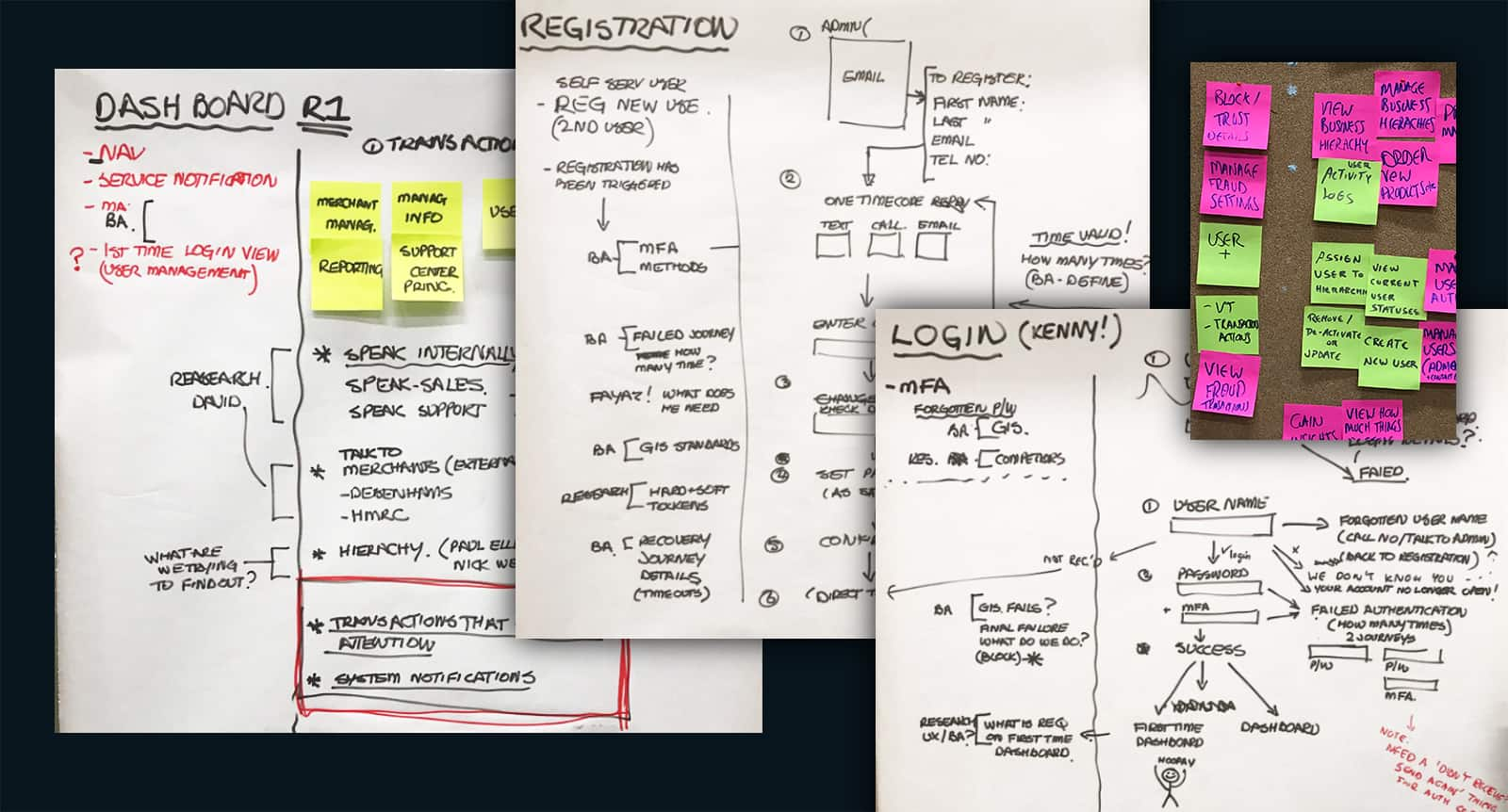
Once all the detailed research had been completed and assumptions finalised various user flows were sketched out. The sketching process allowed UX to present design flows quickly, working iteratively to deliver approved flows/journeys.
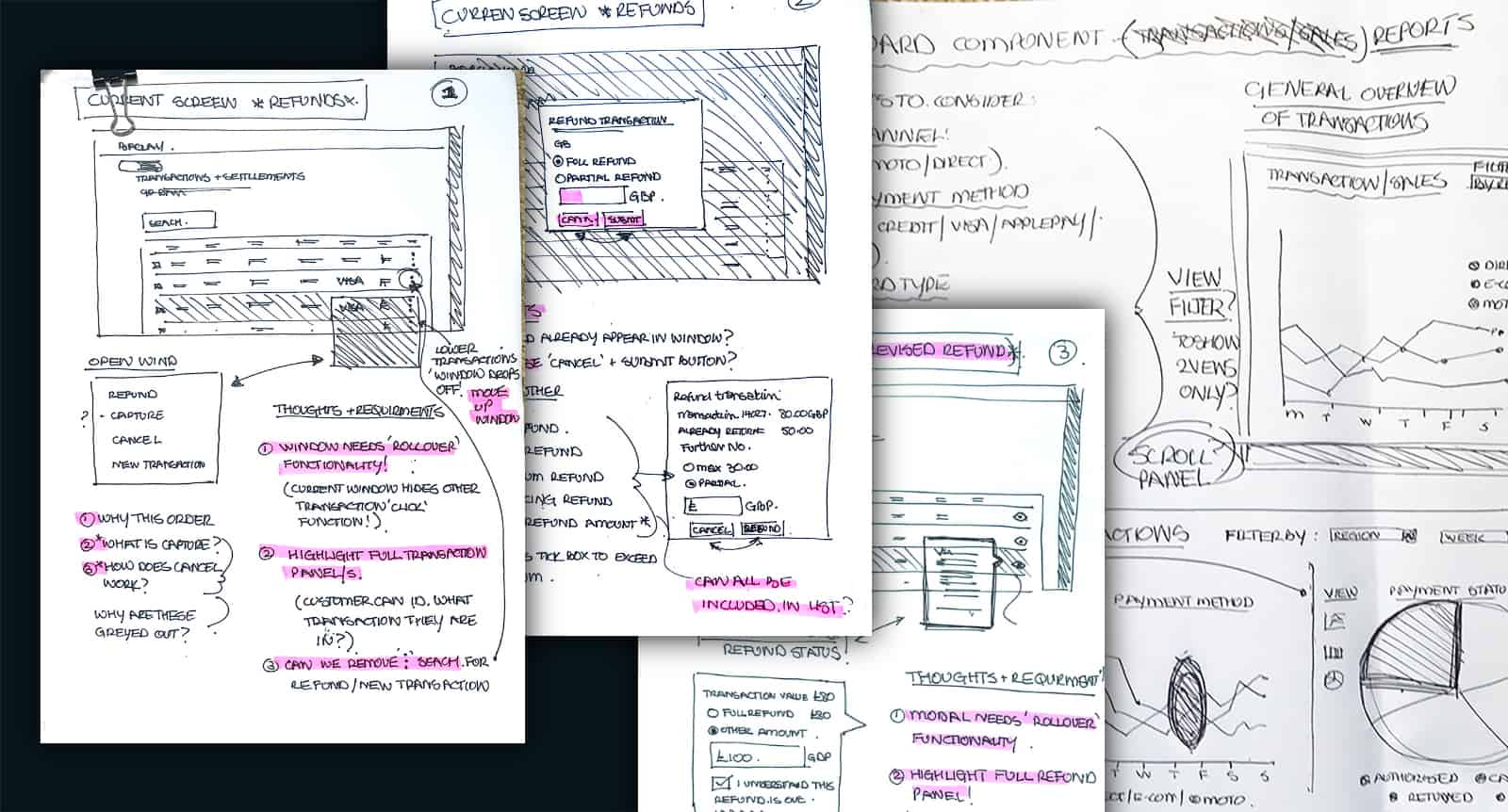
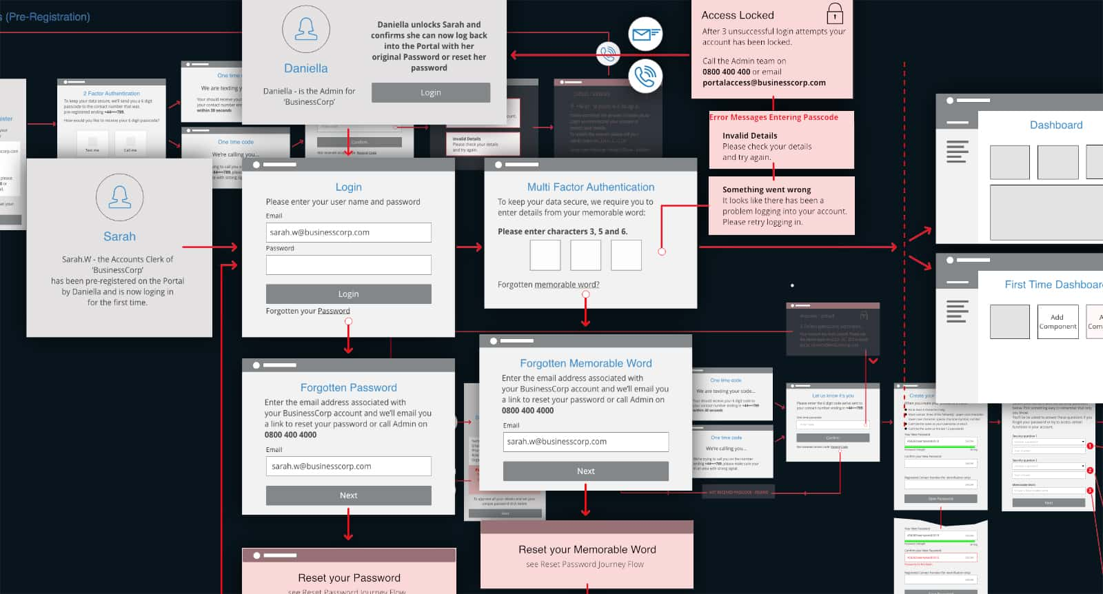
USER JOURNEY MAPS
Once specific journeys/flows had been approved in the sketching process they were then mapped out in more detail. This process provided a clear understanding as to the scope of work and actions required.
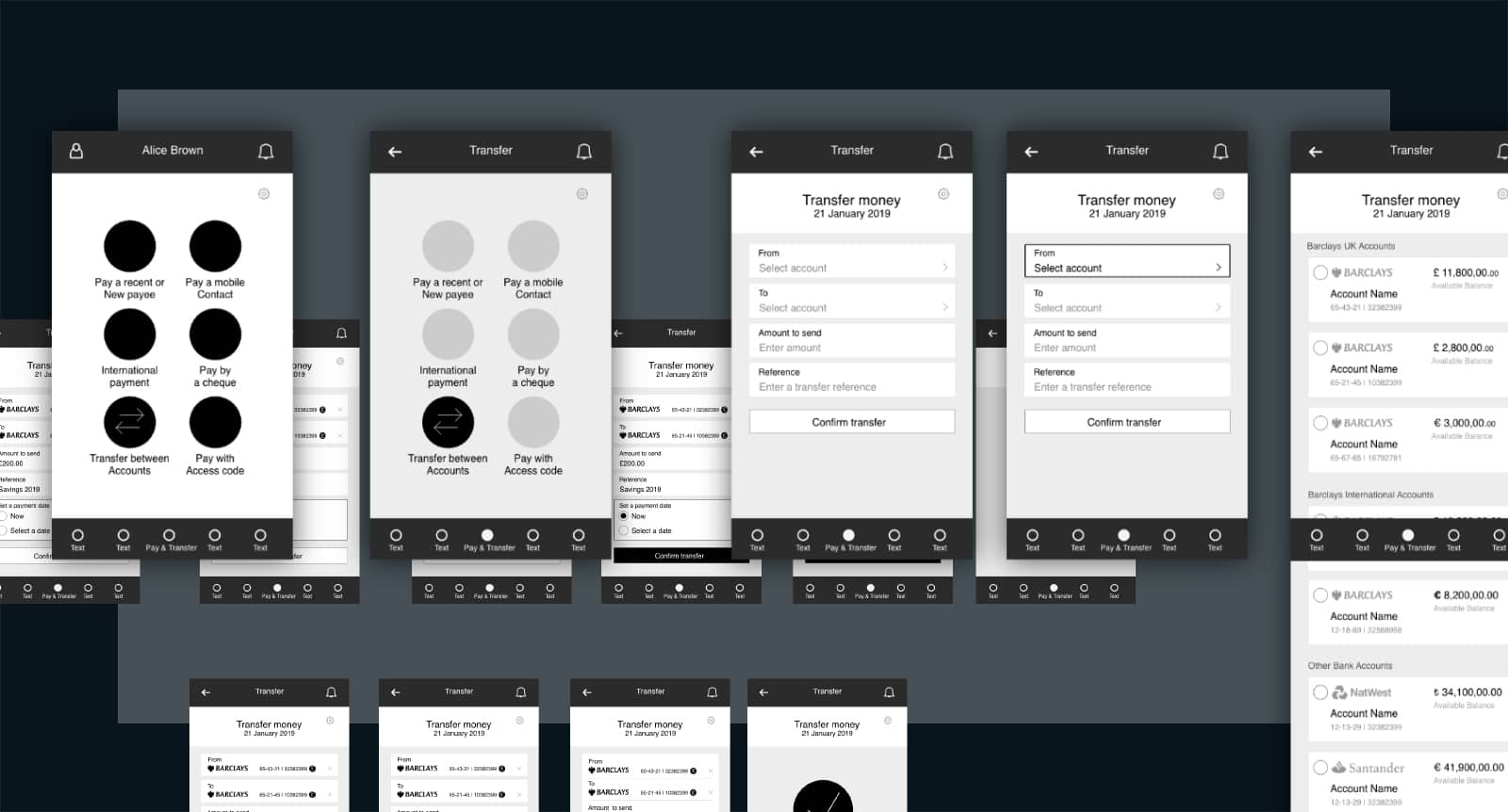
LOW FIDELITY WIRE FRAMES
The low fidelity wire frames and prototypes were created once key POs/PMs where happy with the journey maps. As sprints were based on weekly time frames the designs and prototypes were created in black and white, allowing the flows to be judged on process detailing rather than design aesthetics.
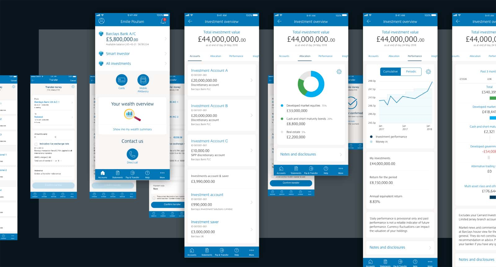
HIGH FIDELITY WIRE FRAMES & PROTOTYPES
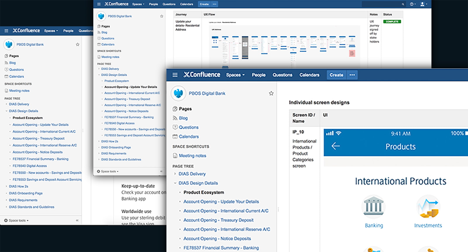
High fidelity wire frames and prototypes were created using the Barclays UI kit and once approved were uploaded to specific Confluence pages where front/backend dev team leaders became involved in taking the work forward.
WORKING IN CONFLUENCE
Atlassian Confluence was a key tool used universally by the UX/UI team at Barclays. It was the hub for all team members and their collaboration needs. It allowed all ideas, content and files to be easily accessible, helping to bring the products to life.
Exploring & delivering targeted, content specific materials to facilitate
New User Experiences (NUE) for iPortal customers.
In-depth research helped deliver true empathetic rational for crucial UX feedback. Sagacious analysis and rational were crucial in determining what steps of the process required additional materials to deliver true user needs and motivations.


